


Data Driven Running: Comparing the Apple Watch Ultra and Garmin Forerunner 945 GPS Data
A quick comparison of the Garmin Forerunner 945 against the Apple Watch Ultra's GPS mapping data

Currently, I’m training for the Walt Disney World Marathon so today’s training plan called for a 22 mile long run. With this longer distance, I figured it would be a great time to compare the GPS performance between the two watches. I’ve always trusted my Garmin in the past, but seeing a nearly .2 mile difference between the two watches was surprising and made me wonder, which of the two maps capture would be more accurate.
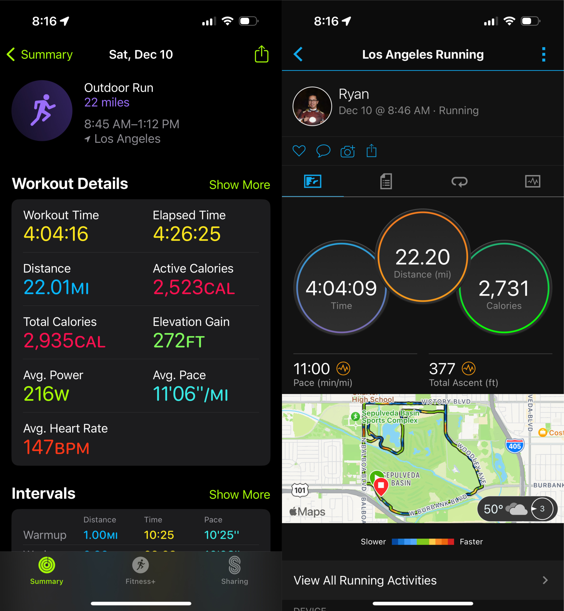
As a start, comparing an Apple Watch Ultra to a Garmin Forerunner 945 LTE isn’t a fair comparison. The Garmin I have now over a year old watch, but has proven to be very reliable in all my training runs and races as well. It does not feature the L1+L5 dual band GPS that Apple has to offer (to note, the newer Garmin Forerunner 955 also offers this but I do not own this watch to do a more fare comparison), but I’ve always trusted the data it presented to me. Take this as a non-scientific comparison and more of just an exploration of my curiosity on the differences between the two.
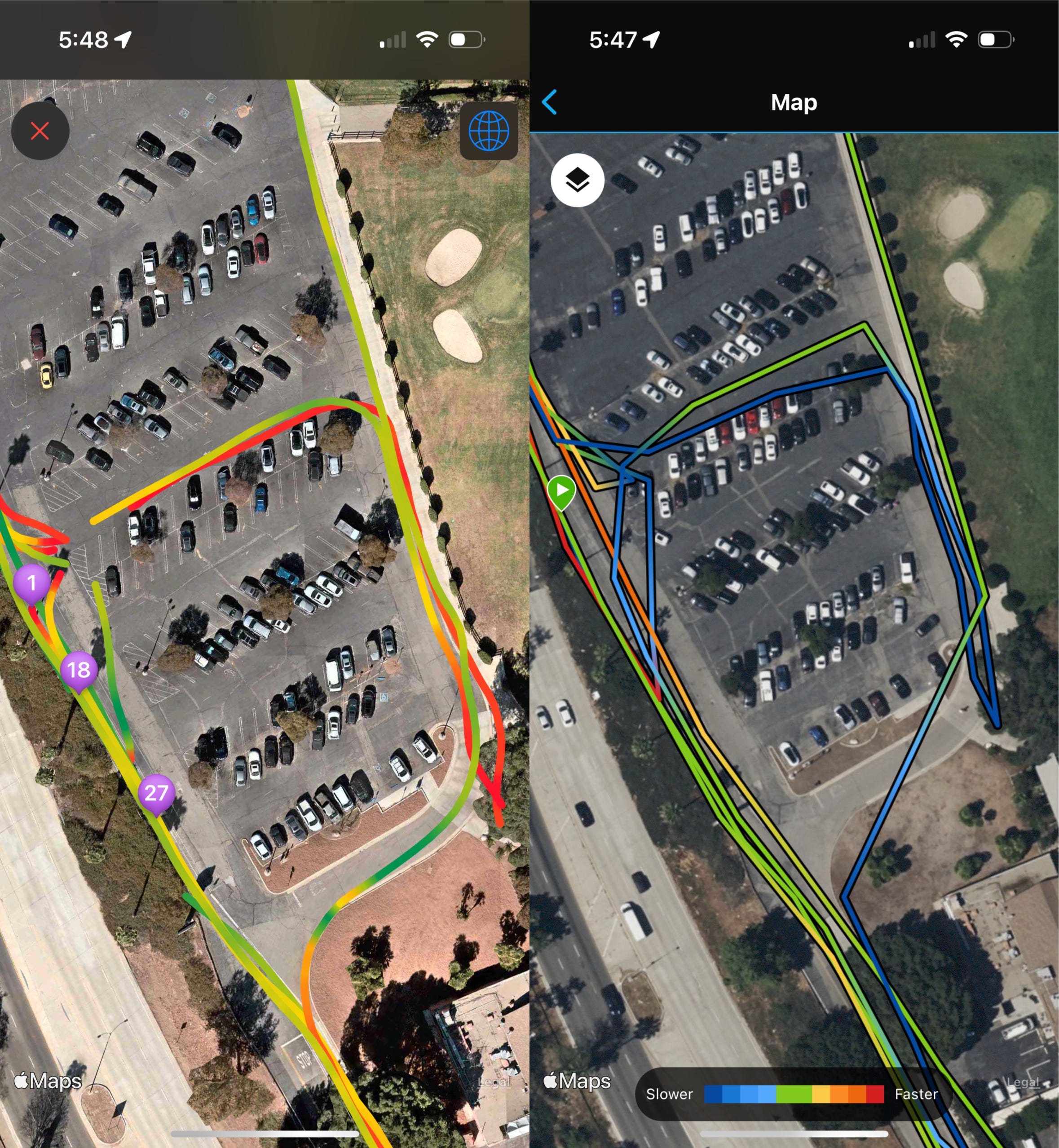
One common pattern I saw between Apple and Garmin is that Apple was doing a lot of smoothing on their paths, but Garmin had more of a “connect the dots” pattern with straigther lines between the GPS points. As a result, when I took a turn, the Garmin produced a sharper path and may have cut that distance short while Apple has a more accurate representation of the path I took.
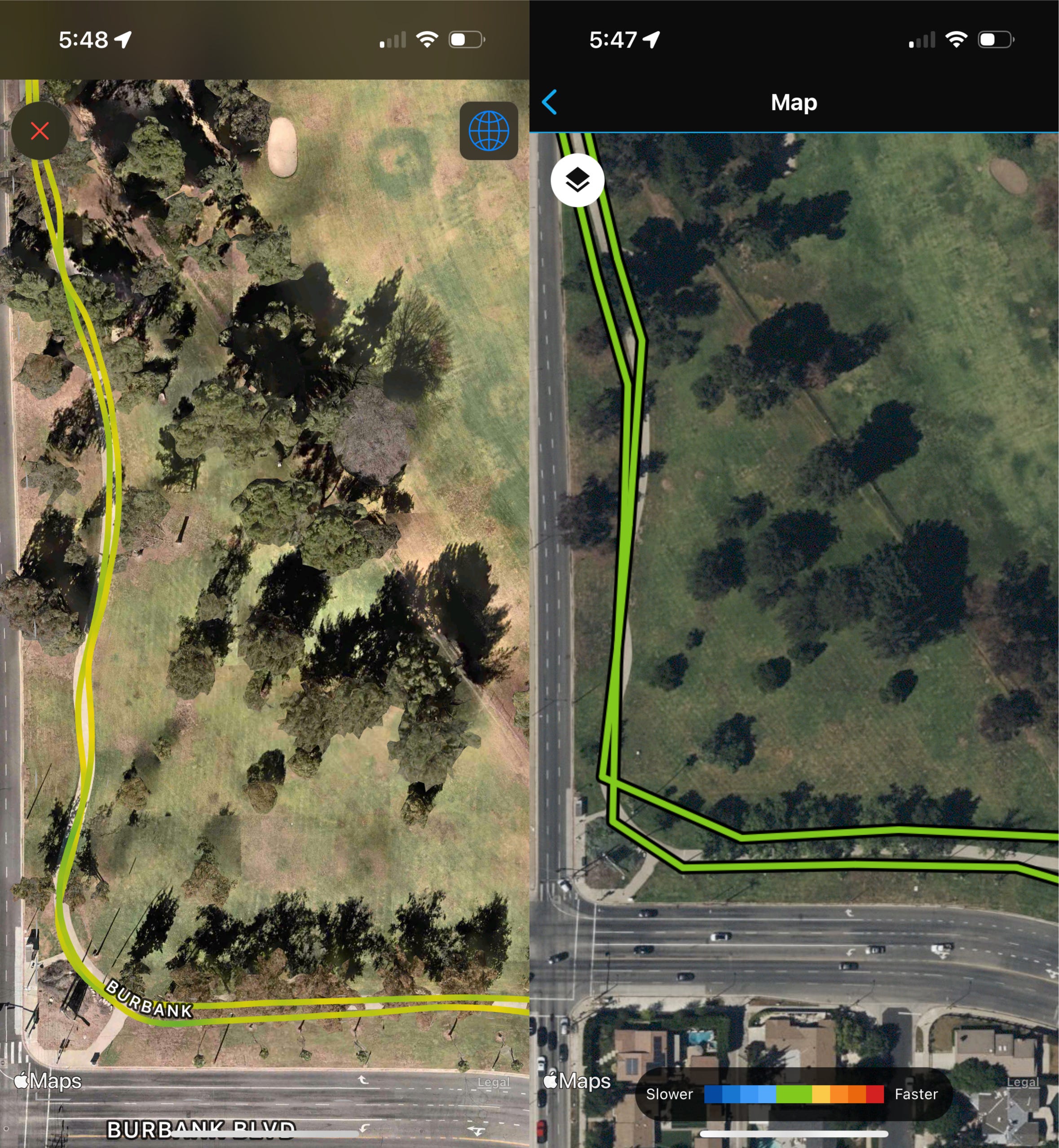
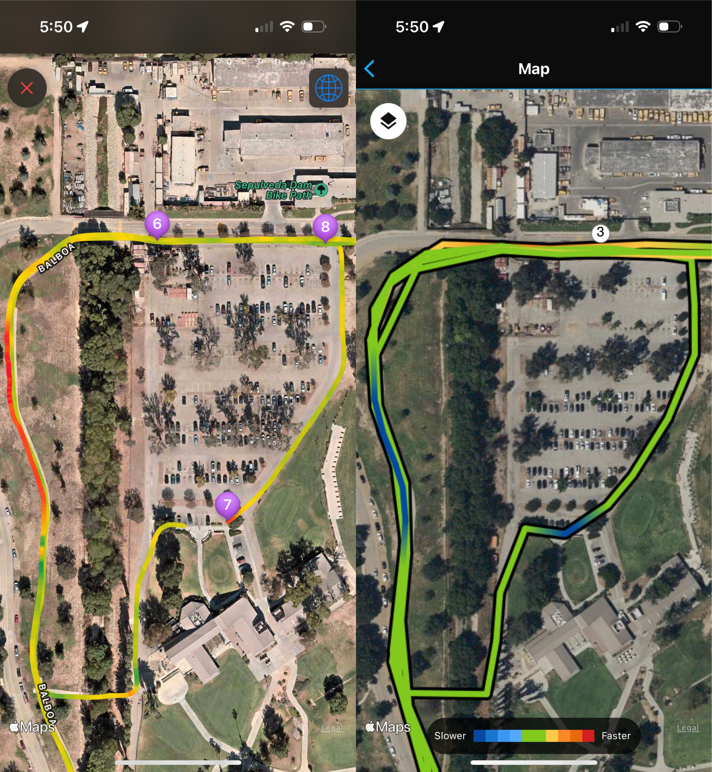
In this next comparison, we can see a clear satellite view of the path I ran with the GPS overlay on top. Apple seemed to nail this path much more spot on, however, similar to the first comparison, we see lots of “connect the dots” happening on the Garmin, resulting in some missed details on the curvature of the running path.
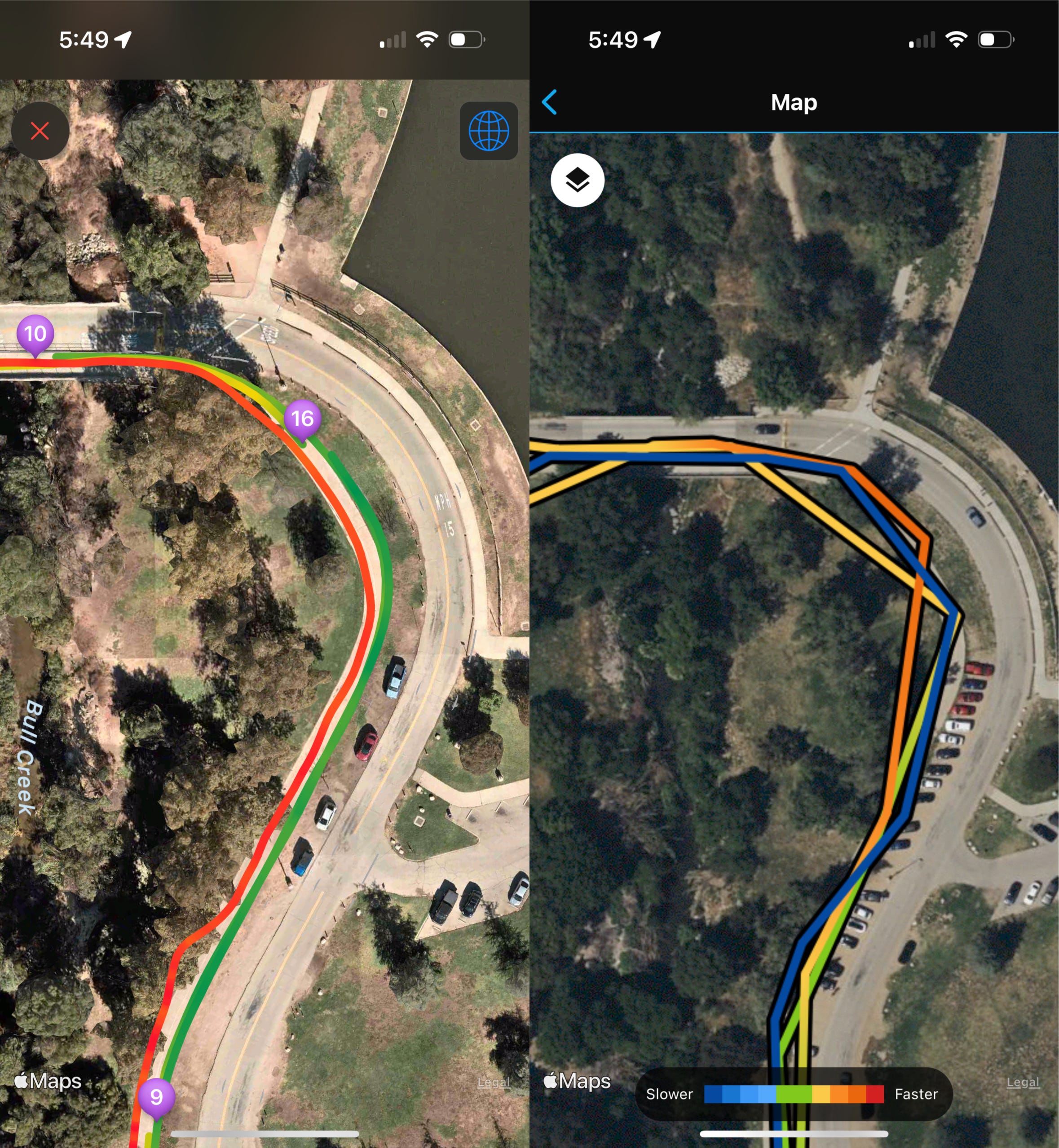
Now the Apple Watch Ultra isn’t perfect. This bit of the path was interesting. While the Apple Watch seemed to do a good job on staying on the path while Garmin continued to show straighter lines, Garmin actually did a better job here of capturing the three times I had crossed this area. For some reason, the Ultra, even with its fancy new GPS tech, lost part of the signal and only captured two of the three times I ran in this area. Notice the broken lines between the 9 and 16 on the Apple Watch map. This area of the park had a clear line of sight to the sky, so the miss here is unexpected.
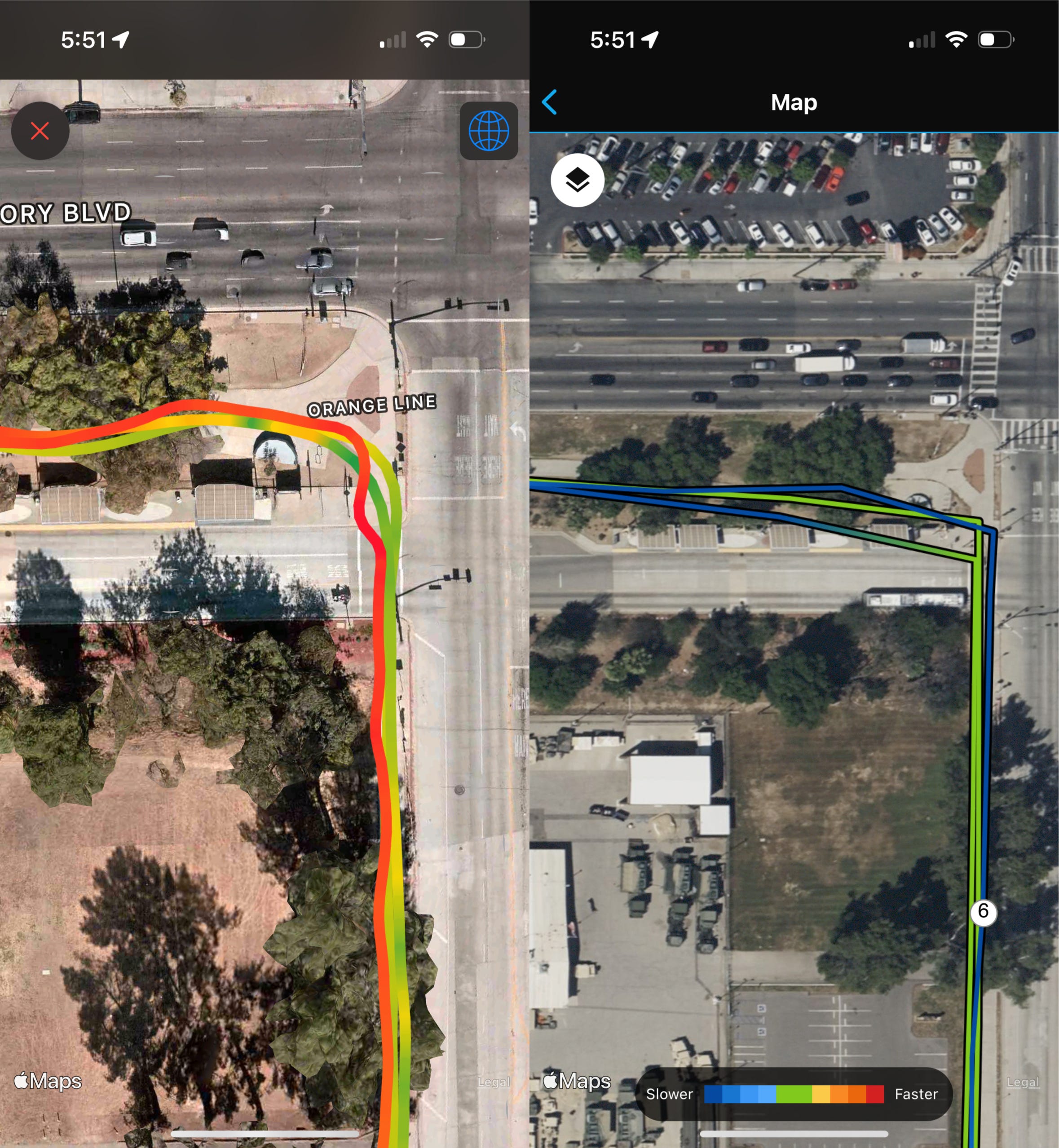
In this comparison, we can see more of the continued pattern with Apple doing a better job in following the running path in the park. One thing to call out here is I did pause my watches around where the 7 is on the Apple Watch map, however resuming the Apple Watch left some gaps as the GPS signal was reconnected but Garmin produced a solid line in that area.
In both areas of the image where Apple did not capture a GPS path, I wonder if they still calculated that area in the overall distance. If they didn’t, that would explain the .2 mile difference between both watches.
In this final comparison, we see more examples of Apple’s ability to stick to the running path more closely, while the Garmin produces straighter lines. For me, this does give me more confidence in Apple’s latest hardware and software, however with the gaps in the maps, it does leave me to wonder which of the two is the most accurate when measuring distance.
In about a month, I’ll be running my next race and plan to wear both watches (primarily, I still have battery life concerns on the Apple Watch), so it will be interesting which of the two will gives the more accurate 26.2 mile measurement of a marathon.